Tuesday, July 23, 2013

Dodge, Burn, and Filters

 Dodge and burn. While not something I am good with yet I did make some progress on learning how to use the tool.
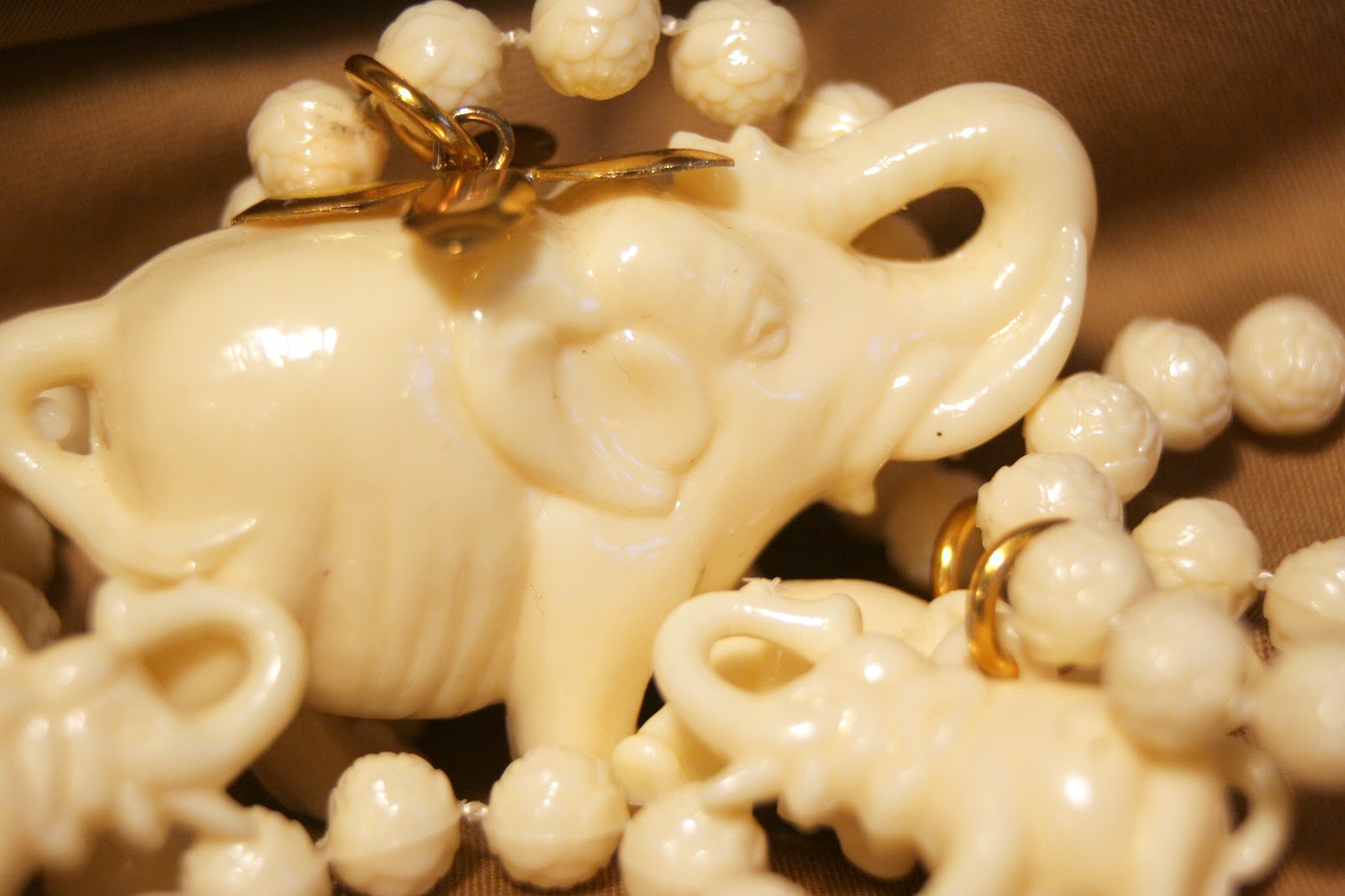
One the elephant necklace I tried out the oilify tool and burn out the background a bit. I like how they turned out. I haven't used this filter much. Here are the three progressions. 


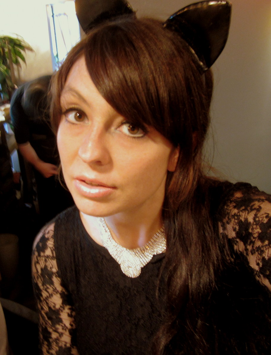
 I used a self portrait and just played with  Curves, Desaturate, and Predator.
\

Friday, July 12, 2013

Adjustments With Gimp


Separated myself from the background using the little lasso. Opened them both as new layers on a new project. 

 The section with just me still somehow attached itself to a white background. Managed to keep the hole open on the background I cut out. I put my cutout layer behind the background and played around until it was in place the best I could. Used the smudge tool to blend edges clean. Much improved. Kept layers separate so I could edit the color on them separately.  Here I changed the color of the sheet and tried to get myself and my shirt back to as normal a color as possible. This is about my real skin tone and the shirt is spot on. Sheet looks like it was always blue/green. Experiment successful. Go Gimp! =)

If you are wondering about my hair, I just cut right through the stray hairs and left them to be edited with the background. Because they were almost black anyway, they melded back with the cutout fairly effortlessly. The stray hairs seemed to help meld the two parts back together again. 

 In The two above I played with different lighting, coloring and filter tools. I think the red is my favorite. Very much like a graphic novel. In the blue/green with black and white me, I changed the sheet to look like canvas. Kind of a cool effect I think. 


 On The two above, I somehow lost my ability to edit the layers separately. I think I saved instead of save as or something else. Not sure. I just played with filters and lighting on these ones. The different tools I used really took away any seams I had left and they seem to have completely melded these two cut outs together.

Second picture to come.


Original. Was covered in water spots from dirty lens. Removed them with the Picasa retouch tool. Easy and handy. Easier than I thought.
Desaturate and Brightness/Contrast. I was trying to create an amateur photo from the 50's. Other than the car being the wrong model, I think successful. Reminds me of my grandmas old overly lit photos.


Curves, brightness, and contrast. It's a bit instagram, but I sill like it for the way the clouds turned out.

Threshold 216/255. Face cut out of another picture, made into layer, resized, adjusted threshold, placed, and flattened image.
Flipped, cropped, and used Posterize Level 2, nothing more, nothing less... I might be getting tired...

Saturday, July 6, 2013

Gimp

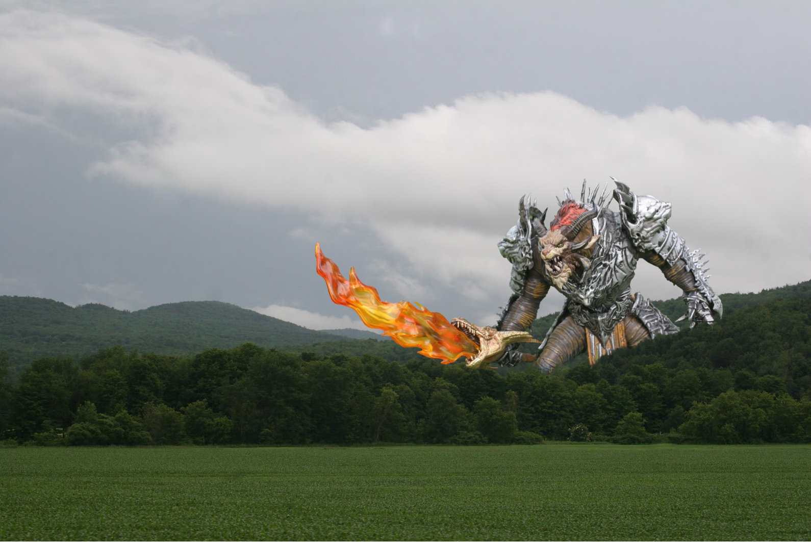
Giant Rytlock-


This was a lot of work. I used the scale tool, the free select tool, the fuzzy select tool, copy, paste, and new layer. In order to get him to look like a giant in the trees, I had to remove a section of trees, paste it back, turn it into a layer, and puzzle piece it back in. I also painted the background dark green in order to make the use of smudge more productive. The white seems were too much to try and smudge away. I smudged the seems away before locking my layers down together. My favorite part is how the sword turned out. I tried to adjust lighting to make him look as dim as the surroundings, but I could quite get it. I will tinker with it later.

Also, without zooming in until I could see each little pixel, I could not have gotten such a perfect edge on this image. If you zoom into the photo, the sword and its pixels are perfectly integrated into the scene. I'm pretty proud of this. It took some serious patience and three or four tries. 


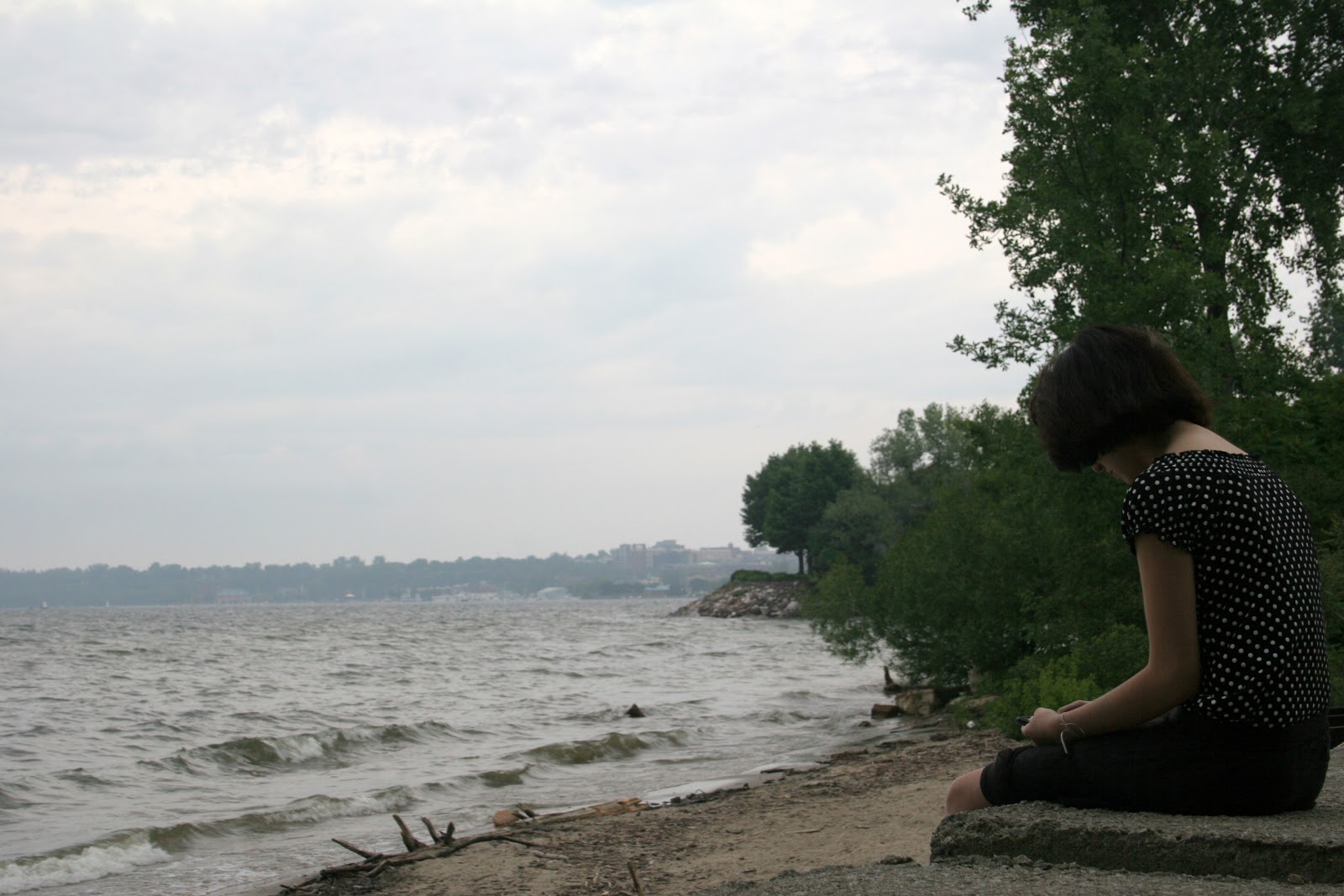
 Lake and Trees -

Same tools as the first picture, far, far less work.


Nature versus Luxury -

All the same tools except I used the scissor select tool effectively for the first time. For some reason, if you fuzzy select a piece away you can use it, but you cannot use the empty space you create effectively. I just moved the tree picture around until the blinking cut out pattern was filled in by what I wanted, then cut the second layer, or tree picture the same way. I then deleted the leftovers and I didn't not have to make the piece fit. the scissor select tool did it for me. I am really happy I was able to finally figure this tool out. It saves a lot of time. I still have much to master on the smudge tool.

Originals -


Saturday, June 29, 2013

A Start - Landscapes

This is moving week for me so between that and the weather, I have no sunny photos. I am traveling today up to Jay Peak! Day off, so I should have more pictures by tonight. My plan is to try and improve what I have done here.

With all of these I was shocked by the quality I lost when faced with gloomy lighting and heavy mist.


So part two. I am sitting on the floor of my empty apartment getting eaten alive my mosquitoes, but it is the only place I have wifi. This assignment has been blood sweat and tears, literally.


Bonus and just for fun. Heavily edited bit of pretty.


Saturday, June 22, 2013

Framing and Picasa


Here is my video and photos. They are not the photos I intended, but I learned a lesson about lens cleaning. It was never an issue with my Canon Elph... I also notice that a lot of quality has been lost in the process of making this video.


Friday, June 21, 2013

Rule Of Thirds


Composition and Aesthetics

I have been taking photos for years. All or most of my work has been an experiment in laziness. When I say this I mean I avoided understanding the technical side of things. I did not study the work of others and I never took the time to pick up a manual for any of my cameras or editing programs. I wasted many many many hours, maybe days, of my life trying to "learn" photography just by tinkering until something worked, me having no idea why it worked our how I could recreate it. If not for digital photography I would be in the poor house from just the wasted film alone or would likely have never pursued it.

In looking up composition and aesthetics I sought out the huge library of photos I have already and I tried to find examples of things I have done in the past by instinct. I believe that anyone on the planet can hit these points just by having human eyes. I think we are able to naturally frame a shot if we are paying attention to what our eyes are telling us.

These of course are not my photos for grading and I am not trying to submit them for grading. I went on a trip to New York yesturday and took the rest of my assignment photos during that trip. I hope they turned out. Going to look at all my pictures from the week tonight. The photos I am sharing here are merely meant to be a part of my blog post, an experiment to see what came to me naturally in terms of my past picture taking.

I used this neat and simple site to see if I was hitting any of these points in the past. I shot most of these old photos on my little Canon Elph.

http://photo.tutsplus.com/articles/photography-fundamentals-articles/14-composition-technique-that-will-instantly-improve-your-photos/

In reading about Composition and Aesthetics I visited quite a few sites and read a few article and while photography is art and very subjective there are some pretty good rules you can follow that will help you improve your stuff. After reading up on it I have a better understanding of why some photos seemed to work and others did not.

Per the web link I provided, what rules do you think apply to any of these photos. In what ways was I successful and what would you have done differently from a technical perspective?